Economic
Systems & General Equilibrium Concepts
The SLF approach, as we shall see, seems to make considerable sense,
although subject
to further definition, revision and extension. However, a major
shortcoming
of the approach/perspective, especially when applied to local regions,
is its
apparent
lack of clear relationships with the rest of the world - surrounding
regions,
countries and world markets and polities. The nodes and pathways
through which these external influences and signals occur are a) the
Transforming
Processes and b) the Strategies (especially migration).
In particular, it should be noted that migration can apply to physical
as well as human capital. In turn, as these effects happen, so
the
internal logics and values applying to the particular region will
respond
and change. You will need at least a conceptual understanding of
the internal logic of the economic system to make sense of these
complexities
- so this section of the notes seeks to provide you with the concepts
and their implications.
These notes deal with:
- The General Equilibrium system of economic
integration
- The Production Possibility Frontier and its
Implications
- Concluding Comments
A. The General Equilibrium
system of economic integration: In Search of Effective Harmony
We are trying to understand how a
whole economy, made up of different
markets
for different goods (and services) which interact with each other,
might
be thought of as working. Obviously, this is a pretty complex
problem.
So we simplify it. We are going to practice some
anthropological or
acheological economics.
We will concentrate on the simplest economy we can think of:
one which
is only interested in producing and consuming two goods (food
(+fibre); clothes (+ shelter)). These two goods, which
can
be thought of composites as indicated, comprise all the necessities of
life, and are all this simple economy produces, or, for the present,
wants
to produce. It is self contained and self-sufficient as a whole.
Our economy is a self-contained collection of producers and
consumers
- everyone is either one or both. In other words, it can be considered
as a Household.
Notice - we are talking of an economy here - which
might
be the world, a country, or a region, or a community or locality
or village, or
whatever.
In the limit, such an economy could be as small as a self-sufficient,
single
and subsistence household. It doesn't matter how big or small it
is. All that matters - for the moment - is that it is
self-contained.
We will come to what can happen when two such economies meet and trade
with each other below. For the present, we just consider the
logic
of this single and simple economy as separate and self contained
entity. And, we are only considering this community as an
economy, not (yet) as a society, or a political entity.
How does our simple economy organise itself?
- to produce food (and fibre), or clothes, or (more likely) a
mixture of
the two.
- to consume (use) food and fibre or clothes, or almost certainly a
mixture
of the two.
What determines how much of each to produce and consume, and hence who
does what?
Consider the production
possibilities
(the supply side) and the consumption preferences (the demand
side)
for the two goods (which makes up the totality of our simple
economy). We are going to draw a diagram, which allows us to
picture the economy, and also allows us to determine certain logical
properties of the choices our economy makes.
The diagram we will use relates production and consumption of one
good
(food (and fibre)) to the production and consumption of the other
(clothes
(and shelter)). So we measure (illustrate) quantities of
each
good on the two axes: quantity of clothes on the vertical axis
and
food on the horizontal axis - though it could just as easily be the
other
way round, it doesn't matter. Get a bit of paper and draw
this
diagram for yourselves now. Then read the following and trace the
argument (logic) out on your diagram as you follow it through.
The supply side:
Consider the production or supply side first. What
options
does our economy have? To use all available production factors
(land
and labour) to produce food; or to use all its factors to produce
clothes; or to produce some combination of the two goods. And, because
our citizens are sensible, they will organise themselves to produce as
much as possible of each good. What? What about leisure and
living? Don't they take time and effort? Yes, so our
production
possibility set will represent the quantities of the two goods our
citizens
are prepared to, are willing to produce, given that any
production
involves use of scarce (limited) time and effort, for which there are
competing
leisure (consumption) and recuperation (investment - see below) demands
So, there is some upper limit to the amount (quantity) of
each
good our citizens are prepared to produce in this economy. We can
mark these two upper limits (F* and C*) on each of the axes
of our diagram of the economy. Producing F* means that will not
produce
any C at all, so quantity of C is zero when Food production is at F*,
and
vice
versa. OK?
But neither of these extremes is likely to be a sensible choice for
our people - they are much more likely to choose a combination of the
two
goods. What are the production
possibilities for mixtures of the
two goods? Suppose we start with the economy producing all food
and
no clothes (at point F*on the horizontal axis), and now ask
ourselves how much
clothing
this economy could produce if it diverted some of its resources from
food
to clothes production. How much food production would have to be
given up to produce the first few units of clothes? Probably not
very much, since some factors of production (land and labour etc.) are
not
very
good for food production and would be much better at producing
clothes.
Furthermore, some of our people would prefer to make clothes
than
produce food, so are likely to be better at producing clothes than
food.
So, to begin with, moving from F* upwards and to the left to produce
more clothes and less food, our economy could gain quite a lot of
clothes
without having to give up much food production. Eventually,
though,
as we progressively cut back on food production in order to produce
more
clothes, we will find that we are having to give up more and more food
for each extra unit of clothing production - as the extra
resources
we need to produce clothes are progressively better at producing food
than
clothes. Eventually, we would wind up producing all clothes and
no
food - at point C*.
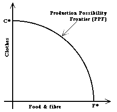 So,
our
production possibility relationship will be curved between F* and
C*.
Make sure you follow this logic and the representation of it as the production
possibility frontier (PPF) on the diagram . This
should
be what you got on your own diagram as you followed the argument
through.
If you didn't, why not? Notice, it is frontier because
this
curve represents the maximum possible combinations of food and clothes
that our citizens are willing to produce, given the land, skills,
technologies
and work preferences they have.
So,
our
production possibility relationship will be curved between F* and
C*.
Make sure you follow this logic and the representation of it as the production
possibility frontier (PPF) on the diagram . This
should
be what you got on your own diagram as you followed the argument
through.
If you didn't, why not? Notice, it is frontier because
this
curve represents the maximum possible combinations of food and clothes
that our citizens are willing to produce, given the land, skills,
technologies
and work preferences they have.
Notice, too, what this PPF means. Suppose we start at point C*
and then ask how many clothes we have to give up to produce some
food.
Move along the PPF, and watch how much extra food we get as we
give
up limited quantities of clothes. At first, we only have to give up a
little
clothes for a lot of food - the slope of the PPF is quite flat.
In
other words, the supply price (cost) of more food in terms of clothes
given
up (the opportunity cost, which here is the total cost
of
food production) is low.
But, as we progress down the PPF, the real cost of
food
(its cost relative to everything else in the economy, which in
our
case is clothes) increases - the slope of the PPF gets steeper.
The
cost of food production increases the more food we try and produce - the
real supply curve for food slopes upwards.
Repeat this argument (logic) for the price of clothes in terms of
food
- you will get the same answer - the real supply curve of clothes
also slopes upwards: the more we want to produce, the higher the cost
in
terms of foregone food production - the higher the real (relative) cost
of clothes.
PPF Conclusions:
- The PPF shows the full employment capacity of the
economy: inside
it means unemployment; outside it is impossible (unless, that is,
we
add to the capacity of the economy - see below)
- So, it also shows the maximum real income our
economy
can generate,
in terms of food and clothes mixtures. Our producers are here
not producing these things just for fun, they are producing them
because
they and their neighbours want them - the products are their income,
their
return for the work they do.
- The slope of the PPF measures the real supply
price
(the
real cost) of producing both goods.
- The supply curves for both products slope upwards
- greater
quantities supplied cost more per unit.
- Notice, too, that this shape implies some considerable
specialisation -
the first of the two key insights of economics into the effective
organisation of societies (we come to the second below). The PPF is
curved precisely because it makes sense for people (and all other
resources) to do what they are best at relative to what they themselves
might otherwise do, so people and resources are employed
according to their comparative
advantage, and specialise in doing what they do best, compared
with what they might otherwise do.
How do we add to the capacity of the economy, and thus increase
incomes?
Any
and all of the following things will increase the capacity of our
economy,
and also increase incomes. Any and all these things will shift the
PPF
outwards (up and to the right).
- By "investing in human capital" - improving the health,
skills and
productivity
of our people - the labour, (and the consumers), or simply gettting
more people.
- By investing in land to make it more productive (draining
it
etc.)
- By improving the effectiveness of our production systems -
getting more
out for the same level of land and labour input - improving
efficiency,
which means one or both of better management (perhaps, ideally
less
management,
since management by itself produces nothing), and better
technologies.
- By investing in capital (tools, plant and equipment)
which
labour
can use with the land to produce the goods.
- By combining these things so that work (production) becomes more
fun
and
more respectable, so that people are more willing to work than before
(a
point seldom, if ever recognised in the textbooks)
What does investment mean here? It means diverting
resources
from the production of food and clothes for current consumption to the
production of "capital" - a stock of new and better resources for
future
production or consumption. So, it is production and use of
another
good - capital. I can't draw three dimensional diagrams very
well,
and you can't read them very well either, I expect. So, for the
present,
we will ignore this complication, or, if you like, consider that part
of
both food and clothing production involves producing capital.
Each
must, actually, since food production requires seed and breeding
livestock
- capital, and clothes and shelter are produced in one period but
expected
to last for longer than one period. This simplification does not
materially affect the basic logic, the basic principles.
The demand side:
What about the consumption or demand side? Now we have
to think about how to represent consumer choices about how much of each
(food and clothes) they would like to have and enjoy. Go back to
your paper diagram. Start with some mix of the two which
represents
one
particular (and observable) choice (F1 of food and C1 of clothes) -
a point (x) which will be in the middle of our diagram somewhere
- it doesn't really matter exactly where. If we imagine that we
are observing this simple economy,they will have already made a
choice about this, and we will see it in their output/activity mix.
But, if you are drawing this
on the diagram with the PPF on it (which you should now have labelled),
you
had better put your x somewhere on this frontier,
hadn't
you? Why?
Otherwise you will be trying to consume mixes of the two goods you
cannot
possibly produce (x lies outside the PPF).
Or
you will be wasting resources - x lies inside the PPF,
which means leaving people and land unemployed when they could be
working,
and working at something they would like to do, and earning a living,
and
producing something we want, and thus earning respect.
So, put your x on the PPF - anywhere else is daft,
(or,
as economists say, inefficient), so we would not expect people to
choose
it, unless they are so stupid as not to be human. This point x
represents
the one the people in our simple economy choose for themselves - it is
the one we would observe them at, if we could find this simple economy
to look at.
Now ask yourself how the consumers in the economy might judge other
combinations or mixes of the two goods that they might have chosen
instead
of x (F1 and C1)? How might they compare other possible points on
this diagram with x?
Within reason, more of each good would typically be considered
preferable
to less of each of the two goods, especially as we have included
capital
in each, - right? So we can identify the north east quadrant (all
points above and to the right of point x) as a preferred
set or zone of possible consumption mixes or 'baskets' of goods.
Draw this zone on your diagram now. And the south west quadrant
(all
points or good combinations consisting of less and F1 food and C1
clothes)
will be considered inferior choices or combinations for our
consumer
population. Otherwise they would have chosen one of the points in
this zone, and they did not. Shade in this inferior zone in now.
So, somewhere in the top left (north west) and bottom right (south
east)
quadrants will lie a boundary which separates the preferred set
of consumption mixes from the inferior set, compared with our initial
combination
x.
There will be a separation between mixes which are preferred and mixes
of goods which are considered inferior - a separation zone or boundary
along which our citizens cannot make up their minds about which mix is
better and which worse - they are, in effect, indifferent between any
of
the mixes defined by this boundary or indiference zone.
This boundary will (has to) slope downwards and to the right,
passing through our reference point, x. So, draw such a
boundary
on your diagram.
You have just drawn what economists call an indifference curve
(or boundary) (let's label it I2, we'll see why in a minute)
which indicates all those
combinations
of food and clothes which the consumers cannot judge to either worse or
better than the one they chose initially (x) - they are indifferent
between
any of the combinations which lie on this boundary or curve. So,
you can now extend the shading of both the preferred zone and the
inferior
zone up to this boundary. Got that? If not, go back and
re-read
the logic and re-draw your own diagram.
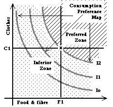 You
should
have got (most of) this diagram. ( I have left off the production
possibility frontier, to make it clearer.) But you didn't get
three
curves, you only got I2. So what are the other curves?
Well,
what we are drawing here is a map of consumer
preferences.
The further north east we go this map, the more preferable the bundles
of goods become (within reason) - bundles to the north east of x have a
higher value to
the consumers than bundles to the south west. The indifference
curve
we have drawn is a contour line on this preference "hill" - a line
joining
together all those points (bundles of the two goods) which are
considered
of equal value by the consumers, the citizens of our economy. So
there are as many other contour lines as we care to draw on this
preference
map. I have just drawn in two others, of lower value than I2, so
I have labeled them I1 and Io respectively.
You
should
have got (most of) this diagram. ( I have left off the production
possibility frontier, to make it clearer.) But you didn't get
three
curves, you only got I2. So what are the other curves?
Well,
what we are drawing here is a map of consumer
preferences.
The further north east we go this map, the more preferable the bundles
of goods become (within reason) - bundles to the north east of x have a
higher value to
the consumers than bundles to the south west. The indifference
curve
we have drawn is a contour line on this preference "hill" - a line
joining
together all those points (bundles of the two goods) which are
considered
of equal value by the consumers, the citizens of our economy. So
there are as many other contour lines as we care to draw on this
preference
map. I have just drawn in two others, of lower value than I2, so
I have labeled them I1 and Io respectively.
Now go back to point x. Ask yourself how much food our
citizens would be willing to give up in exchange for a little more
clothes
- move upwards and to the left of point x along the
indifference
curve, I2.
Why along the curve? Because, if we move upwards and to the
right
of this curve, we are assuming that our consumers consider themselves
to
have suddenly become richer. How come? Because they can get
to a preferred mix of both goods anywhere above and to the right of I2
- (I2 marks the boundary between the preferred set of goods and the set
considered inferior.) They choose x - because they could not get
any mix of goods above and to the right (outside) I2. If they
could
have, they would have, and x would be in a different place than we
supposed.
[This sort of analysis is known, in the textbooks as revealed
preference
theory for this reason - the choices people actually make reveal
their
preferences for what they want, and about how much effort they are
prepared
to put in to get it]
Indifference Curve Conclusions:
An indifference curve also shows a constant real income level
for our economy, where income is now defined as command over
consumption
(and investment) mixes ("demand income"), rather than as the returns
from
production. Note, again, that this is not a distinction that the
textbooks identify. Why not? The answer takes us into some
even deeper conceptual water than we are already in, and I don't think
is necessary here, but you can
follow it if
you
like. It may help you in potential arguments with others who have
followed textbook courses in this subject.
So, if we want to know how much food our
consumers
will be prepared to give up (pay) for an additional quantity of
clothes,
we had better hold their demand incomes constant - otherwise we will
confuse
ourselves about why they are willing to pay more or less for more
clothes.
So we move up the indifference curve I2. As we do so, what do we
see? That our consumers are willing to give up progressively less
and less food for more and more clothes. The indifference curve
gets
steeper. The more clothes they want, the less food they are
prepared
to trade (pay) for them, the demand curve for clothes is downward
sloping.
Alternatively, move down the indifference curve from point x.
The consumers are willing to give up less and less clothes for more and
more food. The indifference curve gets flatter. The more
food
they want the lower the price in terms of clothes (the real price) they
are prepared to pay. The demand curve for food is downward
sloping.
The slope of the Indifference Curve shows the real
demand
prices (the prices consumers are willing to pay) for the two goods.
These
are indeed real prices - each is priced relative to the other
(which
is all there is in this economy).
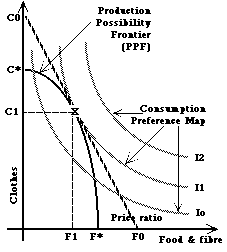
General Market equilibrium: the PPF meets the Indifference
Curve. (or the lecturer meets the class?). We have
now isolated the fundamental dilemma for our
simple
economy: how can we reconcile the production value of goods, as
the things our people are prepared to do for others in return for
income
or payment, represented by the PPF, with the consumption value
of
goods, as the values people attach to consuming or having the goods for
themselves, represented by the indifference curve?
Economics textbooks traditionally start with the partial answer to
this question - the
intersection
of supply and demand curves in a single-good market. As the markets
(the
possible trade-offs) for each of the two goods settle down to their
equilibrium
positions, each will settle on a particular quantity and a particular
price
- at which the supply cost equals the demand price (where the supply
curve
and demand curve intersect). Where will this equilibrium quantity
mix (of food and clothes) be on our production possibility frontier
(PPF)
and consumer preference map (indifference curve map) diagram?
What
combinations (quantities) of the two goods would you expect this single
simple economy to choose? Think, before you read on.
Answer: first, it has to be a mix that our citizens are willing to
produce
- so the combination has to lie somewhere on the PPF. But where?
Where the consumers think they are getting the best value from their
consumption
- i.e. as high up the preference map as possible - on the highest
possible indifference contour or curve. Which is a single unique
point (X) as a combination of C1 clothes and F1 food. This
economy,
or community, cannot do better than this on its own. At this point, and only at this point, the
production value of each of the goods (their supply prices) are equal
to the consumption (demand or use) value of each of these goods (their
demand prices) - exactly what the traditional market diagrams
show, onlyhere for all possible markets.
We should expect a sensible, coherent and communicative, and
cooperative
community to come up with this, given time and no interference from
anywhere
else. This is how we would expect people to learn to behave, if
left
to themselves. What? No, you wouldn't expect this?
They
will fight and bicker? They will steal and thieve? They
will
behave like children, then? They won't grow up and be sensible
and
wise? Why not, if we leave them alone, wouldn't we expect them to
grow up and learn from their mistakes and work out how to do things
better?
Isn't this what humans do, if we leave them alone? If they don't,
they will wipe each other out. These people, in case you hadn't
noticed,
are our ancestors - so they didn't wipe themselves out.
 OK,
so I
have altered the shape of the PPF here - the reason will become obvious
in a minute. For the present, just notice that this different
shape
reflects the capacity of the community, and its willingness to work at
these particular activities - this one is better at producing clothes
than
food compared to the previous one. Why? because it has more
labour and less land, perhaps, and clothing (and shelter) production is
more labour intensive and less land intensive than food and fibre
production. Or because theylive in colder climates, and have discovered
that not only is it more difficult to produce food in such a climate,
but also that they don't need asmuch food if they keep themselves
warmer.
OK,
so I
have altered the shape of the PPF here - the reason will become obvious
in a minute. For the present, just notice that this different
shape
reflects the capacity of the community, and its willingness to work at
these particular activities - this one is better at producing clothes
than
food compared to the previous one. Why? because it has more
labour and less land, perhaps, and clothing (and shelter) production is
more labour intensive and less land intensive than food and fibre
production. Or because theylive in colder climates, and have discovered
that not only is it more difficult to produce food in such a climate,
but also that they don't need asmuch food if they keep themselves
warmer.
At this unique point, this single optimum combination of
food
and clothes, the indifference curve and the PPF will be tangential to
each
other - they will have the same slopes. In other words,
at
this point, the rate at which consumers are willing to give up one good
in terms of the other (the slope of the indifference curve), which is
the
consumer demand price for each good, will equal the rate at which it is
possible to supply one good in terms of the other - the supply cost of
each good - the slope of the PPF. At this point, and this point
alone,
the production value of the two goods will equal the consumption value.
What are these rates? They are the real (relative) prices of
each
good in terms of the other. The supply prices are equal to
the
demand prices at this general equilibrium in our two markets.
And the price ratio of one good in terms of the other is the slope of
the
tangent - the ratio of C0 to F0 in the diagram opposite - the
supply
price ratio of the slope of the PPF equals the demand price ratio of
the
indifference curve. So, this country's markets will settle down
at
a general equilibrium of producing and consuming at point X, =
C1
of clothes and F1 of food.
General Equilibrium (GE) Conclusions:
This conclusion now demonstrates the second
key insight of economics - specialisation (in production) only
makes sense if the products are traded
between producers and consumers, so that needs (demands) can be most
effectively met from the sensibly specialised
production activities. This picture of general
equilibrium requires
specialisation (according to comparative advantage) and trade (exchange
or gift).
The Case for Markets and free trade?
However, GE does NOT necessarily require explicit markets to achieve
this equilibrium. As it stands, this theoretical discussion of
the implications of sensible societies determining how to make
the best use of available resources (assets) does not require any
formal markets, and does not rely on money - it could work with barter,
and it could (and obviously did in the past) work through patronage,
dictatorship, or simple community action. Although much of the outline
explanation provided above has been in terms of real prices (the price
of one good in terms of the other, or the rate at which one can be
exchanged for another, either in production or in consumption), this
does not mean anything more than the rate of barter exchange, where
goods are physically exchanged for each other. Only in the most
primitive sense can such barter exchanges be considered as genuine
markets. The prices referred to above can be, and often are in
so-called primitive societies, implict rather than explicit.
Are markets the only way of achieving this optimum allocation
of resources and goods? Good question. See here
for a discussion of this important question.
Where did money disappear to, in this simple economy?
I
thought economics was about money - and knows the price of everything
and
the value of nothing? Yet we have not actually mentioned money at
all. Another good question. See
here
for
an answer.
Simply making these points highlights the
obvious difficulties of organising societies so as to be as effective
and efficient as possible without organised and trustworthy markets. In
any real society, GE implies some highly enlightened organisation,
achieved in the first instance no doubt by considerable trial and error
(which, of course, we are still making).
Nevertheless, Markets in principle can achieve the best of all
possible worlds, in the real
world in which we live. This is a fact of logic as well
as a consequence of our
socio-economic evolution, not
just
an assertion or an assumption. It is true in principle
and by demonstration of our
history. As humans, we are uniquely capable of
turning our principles into
practice (or, more usually, of developing best practices, and then
working out why the best practice is the best practice, and trying to
make it even better) - that is what we do that makes us different from
the
animals.
If the real world does not live up to this principle in its practice,
then
we will work to understand why, and then work to fix it. This is
science and reason. Anything else is idle speculation or
fantasy.
Simple, isn't it? Tough, isn't it? Is this why you don't
like
economics?
Implication:
The market system rewards the owners of the factors of production
- those who have the most land, the most capital and the labour skills
best fitted, most well matched to the wants of society (the consumer)
will
earn the most production income, and thus get to exercise the most
money
votes about what is produced. If you (land, labour,
capital,
or management) are useless, you won't get paid in this system, and you
won't get the chance to exercise your consumption income. To him that
hath
shall be given - from those who are most able, but not
(necessarily)
to those who are considered most deserving (except in the most happy
(and fictitious) of societies - we still have a lot to learn, but then
we haven't been practicing for very long in the wider scheme of the
universe). Because markets tend to evolve into capitalism - the separation of
ownership and control of the means of production (especially physical
capital and land) from the people involved in their use, and
trade (exchange) of these assets between people, the economic system
can result in the survival of the richest, rather than the survival of
the fittest - so long as the poor are sufficiently content (or
cowed) to accept their lot without social revolution or exit
(migration).
So we would also expect our sensible human community to show some
humanity
and seek to soften the harsh realities of natural selection (since that
is what this system really is). Our community will also develop governance
and redistribution (care) systems alongside its
market
systems. Why? Because, some form of government is an essential
complement
to this trading system - the long
arm of the law is necessarily
attached
to Adam Smith's invisible hand of the market - to outlaw theft,
enforce
contracts and protect property rights (whether these are common rights
or private rights). Once in place, such governments will also
become
responsible for managing the natural
selection of the market -
including
acting as judge to redistribute losses and gains, and protect or
support
the less well off. The humane economy will naturally develop
gifts
from those who have to those who have not, which will be outside the
system
of specialisation and exchange portrayed here. But not independent of
it, since the
capacity
to give depends on the resources one can accumulate and incomes one can
generate.
We have not concentrated on either the sociology or the politics of
our economy, our community, here - because this is the economic basis
of trade and exchange.
But it is nonsense to pretend that these aspects of humanity do not
exist,
or that economics is fundamentally different and separated from
them.
They have to fit, and the way they fit is through the governance (or
management,
if you prefer) of the market system.
If they don't get these aspects right as well, then their markets
cannot work either.
Finally, in this session - the benefits
of Trade.
Now, at last, we are in a position to look at the benefits from
trade.
Suppose, now, we have another community (or region, or tribe, or
country, if you
prefer).
This second country - country 2 - is different from country
1. The PPF for country 2 shows
that the country is better at food production and not so good at
clothing
production as country 1. The preference maps are shown here as
identical
for
the two countries, but they do not need to be. On its own, then,
country 2 would choose to
produce
and consume C2 clothes and F2 food, at a real price ratio of C3/F3.
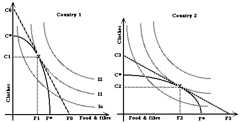
Now suppose you are a trader. You have an opportunity to do
business
between these two communties (labeled countries here). What are
you going to do? Buy
clothes where they are cheap and sell them where they are expensive,
and
the same thing for food. And where is food cheap? In
country
2 - you don't have to pay as much in clothes in country 2 as you do in
country
1. And clothes are cheap in country 1. So there is money to
be made shipping food from country 2 to 1 and clothes from 1 to 2 -
right?
Just think about the meaning of the slopes of the "price lines" in each
country - they show the price of one good in terms of the other.
And what happens when we start to trade - exporting food from 2 to 1
and clothes from 1 to 2?
The price of food will rise in country 2 (the food exporter), and thus
the price of clothes will fall in 2. Country 2's "price line" (C3
to F3) will get steeper. The opposite will happen in country 1 -
the line C0 - F0 will get flatter.
And what will limit this process of price changes as a consequence
of
trade between to two countries? The free trade or "world price"
will be the same in each country -
the
slopes of the price lines will be the same, flatter than 1's and
steeper
than 2's (ignoring the costs of the exchange or trade) The
trading price line will lie between the price lines
of the two countries (or regions), as in the figure below (Ce - Fe). I
have omitted
the previous no-trade price lines from these diagrams, to make them
clearer.
But you should be able to re-draw these for yourselves.
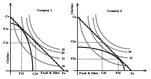
So what? At this price ratio, country 1's optimum consumption
point
is now C1c of clothes and C1f of food. This is where the trade
price
line touches the highest possible indifference curve. A higher
indifference
curve than it can possibly get to without trade - a higher
consumer or
demand income - so it is definitely better off with trade.
How does it manage to consume this amount of food (which is more
than
it could possibly produce itself in this diagram - C1f lies outside the
PPF)? Answer - it imports food, and pays for these
imports
with exports of clothes.
How much food and clothes would it pay country 1 to produce?
Where
the trade price line is the same slope as (lies tangential to) the PPF
- since the slope of the PPF shows the supply price ratio of the two
goods
- the price ratio which matches the opportunity costs of producing each
of the goods. So, country 1 produces P1c of clothes, and P1f of
food,
and trades (P1c - C1c) clothes for (C1f - P1f) food, which it can do
along the trade price line.
The exports [production minus consumption] of clothes pays for the
imports
(consumption minus production) of food, at the trading price ratio
between
the two products. And country 1 is clearly better off with trade
than without it, since it can now consume above (beyond) the limits of
its production possibilities. The same arguments apply to country
2. Follow them through for country 2 for yourselves.
Conclusions from Trade:
- Country 1 is said to have a comparative advantage in
clothing
production
- it can produce clothes relatively cheaply in terms of food,
whereas
country 2 has a comparative advantage in food production. Notice,
importantly, that one of these countries could be absolutely
better at producing both goods - able to produce both more food and
more clothes per person or per hectare. But this would make absolutely
no difference to its comparative advantage. Unless both
countries
are absolutely identical (in which case their real prices would
also be
identical, and there would be no gain from trade, and thus no trade) ,
one must have a comparative advantage in one good and the other
must
have a comparative advantage in the other good - fact of logic;
mathematical
certainty; law of human nature - call it what you like. Notice - trade relies on differences - so,
if globalisation is simply a trade phenomenon, it will not on its own
produce a single global homogeneity - differentiation is much more
sensible and likely.
- In particular - there is no way that one country can
possibly
have
a comparative advantage in the production of both goods.
Having a comparative advantage in one good automatically means
that
the country has comparative disadvantage in the other. This
result is perfectly general - it holds however many goods we might like
to consider - any country (region) will have a comparative advantage in
something
- something which it is relatively good at compared with all the other
things it might be able to do.
- Trade allows these countries to exploit their
comparative advantages,
buying (importing) things which are relatively cheap from elsewhere and
paying for these imports with exports of things which are relatively
cheap
in this country, and thus relatively expensive elsewhere.
- It will pay countries to specialise in the things which
they
are
relatively good at - the things in which they have a comparative
advantage.
Country 1 here specialises in clothes - producing more than it is
willing
to consume, and country 2 specialises in food (& fibre) production.
- Trade prices equalise between countries as trade occurs,
which encourage
the appropriate supply and demand responses to exploit these
opportunities
for specialisation
- The results of this logical analysis are unambiguous
- trade
pays and is of benefit to everyone. There is no doubt
about this
- it is a fact of logic - it stands to reason. Not
believing
this
is exactly equivalent to not believing that the earth is round and goes
round the sun - it is daft, nonsensical, illogical, without foundation.
- It is also, I argue, a fact of life as well as a fact of logic -
because
the principle of specialisation and trade according to comparative
advantage
is a basic principle of evolution and natural selection. Rabbits
don't try to be wolves - they get better at being rabbits, and working
better with the resources and conditions in which they find themselves.
This is how natural ecosystems work, as well as how markets work.
But this is another story.
Notice, too, that this logic implies THAT ANY IMPEDIMENT TO TRADE CAN
ONLY REDUCE THE SOCIETY'S ABILITY TO MAKE THE BEST OF WHAT THEY HAVE
GOT. If we impose additional costs (i.e use up scarce resources
of land, labour, management or capital) on our exchanges with our
neighbours or cousins, we necessarily
shift our exchange price line back towards the autarchic (no trade)
position and away from the free trade position. This makes us worse off
than we could be without these restrictions. In other words, we had
better try and make sure that any impediment to trade is worth
the costs we necessarily impose on ourselves by trying to block
trade. For the moment, transport and marketing costs are
logically
legitimate - we cannot exchange the goods and services without someone,
somewhere being able to make a decent living actually doing the job of
trading. BUT, we would expect that they should be kept honest and
efficient by the threat of competition - if someone else can do the job
more efficiently, we would expect any sensible society to let
(encourage) the more efficient people to do the job - survival and a
decent living to the fittest, natural selection - the best way of
managing complex systems we yet know about.
Why, then, is there apparently so much resistance to the idea of
economics,
markets and, especially, free trade? Well, what do you think? Stop
and
consider this question and your answers before returning to the Index
page!
Meanwhile, here is the OECD's
case for
Free Trade, written and evidenced in more conventional style.
Also, for those interested in a'real' world example of the effects of
liberalising trade (and removing trade protection and producer support,
see here for an account of
New Zealand's
liberalisation reform.
Back to top
B. The Production Possibility
Frontier and its
implications
To make sense of this complexity,
it is necessary to simplify it, and
abstract
from reality to identify the key relationships. One way
of doing this is to return to the notion of a Production Possibility
Frontier.
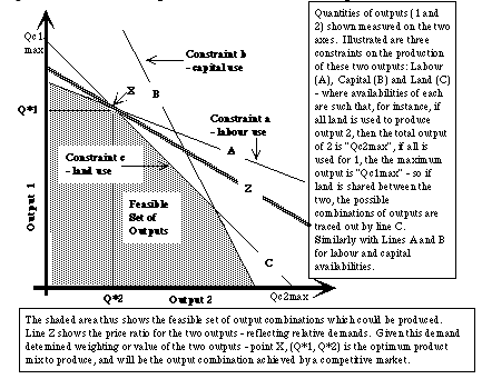 Figure
1: Here, we consider just three uniform and
homogenous sorts
of capital: Land, Labour and Physical Capital, and just two possible
outputs
(again homogenous), 1 and 2. We measure the output levels on the
two axes of this diagram. Given the availabilities of the each of
the forms of capital, there are upper limits to the amounts of each of
the outputs that it is possible to produce (illustrated as Qc1max and
Qc2max
given the land requirements of each output- constraint line C).
The interaction of each of the three capital constraints defines the Feasible
Set of Outputs - the shaded area in this digram.
Figure
1: Here, we consider just three uniform and
homogenous sorts
of capital: Land, Labour and Physical Capital, and just two possible
outputs
(again homogenous), 1 and 2. We measure the output levels on the
two axes of this diagram. Given the availabilities of the each of
the forms of capital, there are upper limits to the amounts of each of
the outputs that it is possible to produce (illustrated as Qc1max and
Qc2max
given the land requirements of each output- constraint line C).
The interaction of each of the three capital constraints defines the Feasible
Set of Outputs - the shaded area in this digram.
If the rate at which the two outputs can be traded for each other in
the market place is represented by the trade price line Z,
(which
indicates one of the more important links with the outside world), then
the appropriate (economically efficient) production mix for the region
is Q*1; Q*2 - which will define the economic structure and income
earning
ability of the region, and will be the outcome expected by the
operation
of an effectively competitive market place.
Notice - if the capital asset base of this region is increased, then
the constraint lines shift outwards from the origin - the productive
capacity
or feasible set of outputs for the region is increased. Notice,
too,
that we could also include measures of the other two major forms of
capital
(spatial and social), and could also further subdivide these major
forms
into their componant parts (with differing relative capacities in the
production
of the two goods (or services), which would tend to make the PPF (the
Feasible
region) even more convex to the origin (bowed outwards from the
intersection
of the axes). We could also consider a greater number of outputs
- though drawing the diagram would then become even more messy.
However,
if we can draw the diagram, we can also express these relationships
mathmatically,
and thus remove the difficulties imposed by a two dimensional
representation
of the problem as a diagram.
One obvious problem with this representation of the capacity or
capability
of a region or community is that the production systems available to
transform
the capital assets (combined with appropriate inputs) into the
potential
products or outputs is not uniform - the representation of the use of
capital
assets to produce outputs 1 and 2 in this figure as if they could be
trasferred
between uses at a uniform rate (the constraints as straight lines) is a
gross simplification. However, this is not a serious problem.
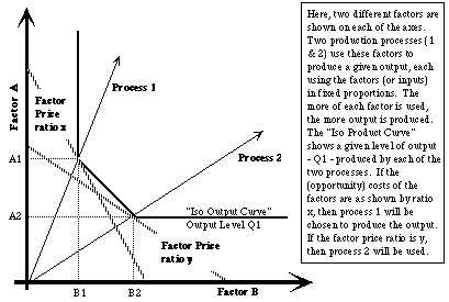 Figure
2: Consider the simplest relaxation of this initial
assumption
- that there are at least two different ways of producing a single
output
(Process 1 and Process 2). Process 1 uses more of factor A
(capital
type A) than factor B in producing output 1, while Process 2 uses more
of B than A. If you like, Process 1 is the capital intensive
production
system, and 2 is the labour intensive alternative. The choice of
which process is the most appropriate (most efficient) depends on the
alternative
uses possible for each of the factors - what they could earn doing
something
else instead of producing output 1 (their opportunity costs). If
these opportunity costs are as represented by the ratio of values
(prices)
as price ratio x, then process 1 will be the most efficient use
of these factors for output 1. If the price ratio is y,
then
the most appropriate (efficient) process is process 2.
Figure
2: Consider the simplest relaxation of this initial
assumption
- that there are at least two different ways of producing a single
output
(Process 1 and Process 2). Process 1 uses more of factor A
(capital
type A) than factor B in producing output 1, while Process 2 uses more
of B than A. If you like, Process 1 is the capital intensive
production
system, and 2 is the labour intensive alternative. The choice of
which process is the most appropriate (most efficient) depends on the
alternative
uses possible for each of the factors - what they could earn doing
something
else instead of producing output 1 (their opportunity costs). If
these opportunity costs are as represented by the ratio of values
(prices)
as price ratio x, then process 1 will be the most efficient use
of these factors for output 1. If the price ratio is y,
then
the most appropriate (efficient) process is process 2.
Furthermore, we can think of subdividing our major capital (factor)
classes into those biits which are more suitable for the production of
one good or service rather than another - output specific factor
classes
- which would introduce more constraints on the first of these two
figures.
In the limit - a particular capital class which is only suitable for
the
production of one good, and completely useless for the production of
another,
makes the relevant constraint line in Figure 1 either vertical or
horizontal
(depending on which is the relevant output).
These conceptual relationships can be explicitly modelled using linear
programming techniques, which replicate this logic for many outputs
and many different factors (capital classes) and processes.
The fact that many of the particular ouputs and capitals relevant to
the problems of rural development and sustainable resource use are
difficult
to measure accurately, and that the processes used to produce the
relevant
outputs are not well known or understood can be viewed from two rather
different perspectives:
- It is therefore impossible to simplify the problems and issues in
this
manner, still less hope to model the various alternatives in a
computable
form - so this whole exercise is a waste of time. However, if you
take this stance, then you are obliged to advance an alternative
framework
which can be used to seriously address then problems and issues.
- These facts identify and emphasise the critical difficulties of
managing
(or even managing with) these complex systems - that of generating good
understandings of the ways in which they actually work and could be
conceived
of as working differently. The solution is then to make educated
guesses about the capacities available and the process transformations
which could be used, and experiment with their consequences.
Back to top
CONCLUDING COMMENTS
It is notable that the economic
framework of trade and specialisation - the foundation of markets -
seems, at first sight, to be directly counter to the ideas of
sustainable livelihoods and, especially, diversification of rural
incomes. Although the notions of using limited household assets (scarce
resources) as effectively as possible underlies both approaches to
social organisation, the SLF approach emphasises (at least under
Ellis's treatment) the value of diversification, and by implication,
non specialisation, while the economic principles of general
equilibrium appears to emphasise the value and importance of
specialisation.
However, more careful thought indicates that the two approaches are not
at all contradictory.
First, the SLF approach implicitly emphasises the fact that
assets are heterogenous -
they are different and have different uses and comparative
advantages, even at different times in the year or season, and are
differently mobilised under different social organisations and
institutions. Under these (real world) conditions, it should not
be surprising that households will generally find themselves to be
better off if they adapt their activities to exploit the different
comparative advantages of their resources, and hence exhibit
diversified activities depending on the conditions they face.
Second, the simple economics of production possibility frontiers
does not (typically)
result in complete specialisation - some people and their resources
remain employed in the production of the imported good.
Third, the simple economics ignores the difficulties and
problems associated with risk, uncertainty and insecurity.
Incorporation of these considerations leads to the common-sense
solutions of diversification and (some) self-sufficiency - as a
fall-back or security strategy.
Back to SLFA Index
Comments or suggestions
to DRH