All may not be what it seems - the construction of the data needs to be understood.
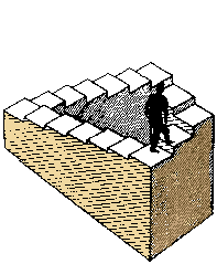
Perspective counts - but make sure it is a real and not an imaginary perspective - the eternal triangle:

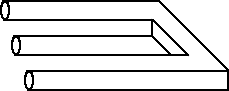 is this a post modern fork (with
no handle)?
is this a post modern fork (with
no handle)?and make sure that you are not confused by extra, or extraneous information.
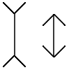
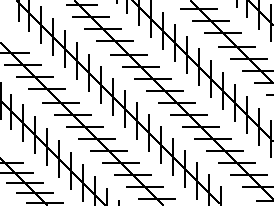
The diagonal lines in this picture above are all parallel, and the two vertical lines are the same length.
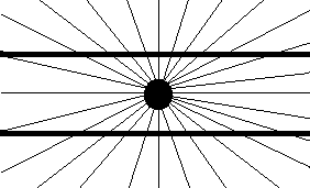
 The horozontal lines
around the 'sun' are parallel and straight, while all the squares on
the left are actually proper (straight-sided) squares
The horozontal lines
around the 'sun' are parallel and straight, while all the squares on
the left are actually proper (straight-sided) squares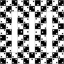 and there are no
curved or wavy lines in the frame on the right.
and there are no
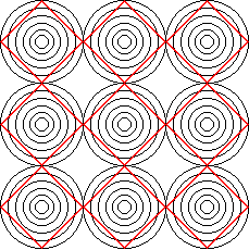
curved or wavy lines in the frame on the right. the two black circles in the
centre of each of these contstellations are the same size.
the two black circles in the
centre of each of these contstellations are the same size.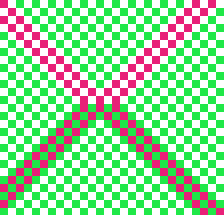
The red squares in the top and bottom of the X on the right are the same colour.

There are NO grey spots at the corners of the squares on the left.
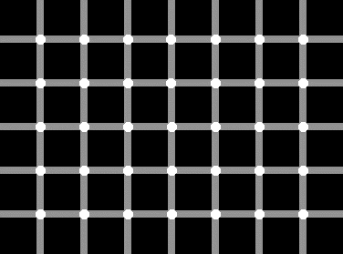
The circles at the intersections in the frame below are all white.
When interpteting data - the aim is to make sure you are all white or 'orl right. On the other hand, too much apparently careful scutiny and deconstruction of your data - of whatever sort - can make you blind or daft or both - so be careful, FIRST choose a sensible problem, and SECOND, try and come at problems from as many different angles as you can!

which way up are these boxes, and which is the front face? Who cares - trying to sort this one out will give you a headache you can do without.
Back to Quantitative Approaches